Project Listing SaaS App
DISCLAIMER: Some of the work I've done for past employers is private and I’m unable to share it directly in a public forum. For this project I have created an example without branding and changed the scenario from healthcare to a Marketing/Design Agency Project & Billing Software. Bare in mind that these projects may be missing sketches/discovery examples that I cannot include due to their private nature.
Challenge
Our current project listing was 10 years old, with an outdated UI and poor experience. My task was to redesign the screen, bringing it up to our current UI Standards and providing a better overall experience to the user.
Role: UX Designer
Tools: Pen & Paper, Sketch, Axure
Discovery
Before we began designing the new listing, we talked to users about the current one. We kept hearing that users struggled with knowing where their projects were in the life cycle. All projects follow a similar flow from start to finish, but under the current design finding where a project is in that flow was time consuming and tedious.
Design
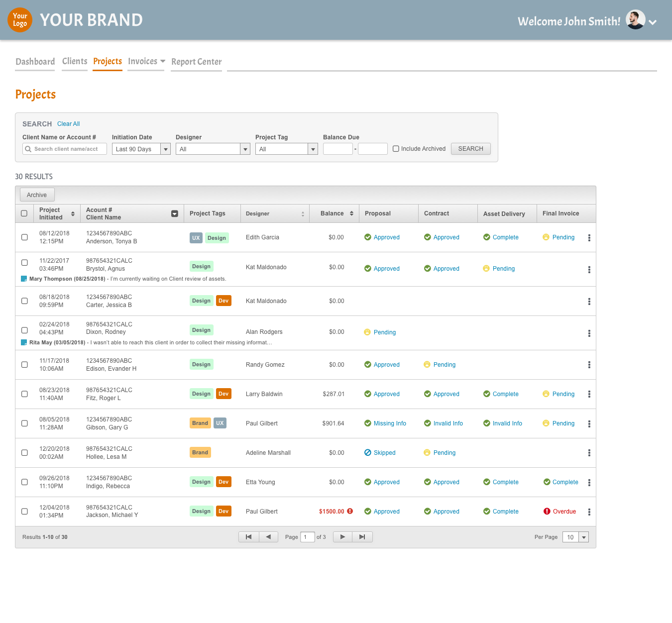
So all I knew when we started sketching ideas for the new screen is that we needed to take the project listing from a simple list of projects into a holistic view of a project and it’s current status.
In my first draft I kept the design simple, the icons indicated whether or not that step in the life cycle was completed and there was a link next to the icon, when clicked it would open up that item in a popup window/new tab. I made an educated assumption based on the discovery that users would want the ability to quickly pull up the articles associated with a particular step to view/print/share.
Testing - Voice of Customer Calls (VOC)
However, in our initial VOC calls, we learned that users didn’t necessarily need to pull up the contract or proposal from this screen, they just wanted to know if that step had been completed. They did like the new screen better than the old one, but the old screen was so outdated, of course the new one was better. I knew I couldn’t pat myself on the back and call it a day. I had to ask the right questions to find out exactly what experience they really needed- even if they were satisfied with the way it was.
When asked if the users could clearly see the current status of their project, most agreed they could but they were confused why some of the columns were blank. It wasn’t intuitive to many that blank columns indicated that step hadn’t been completed yet and/or there was no information to view at the time.
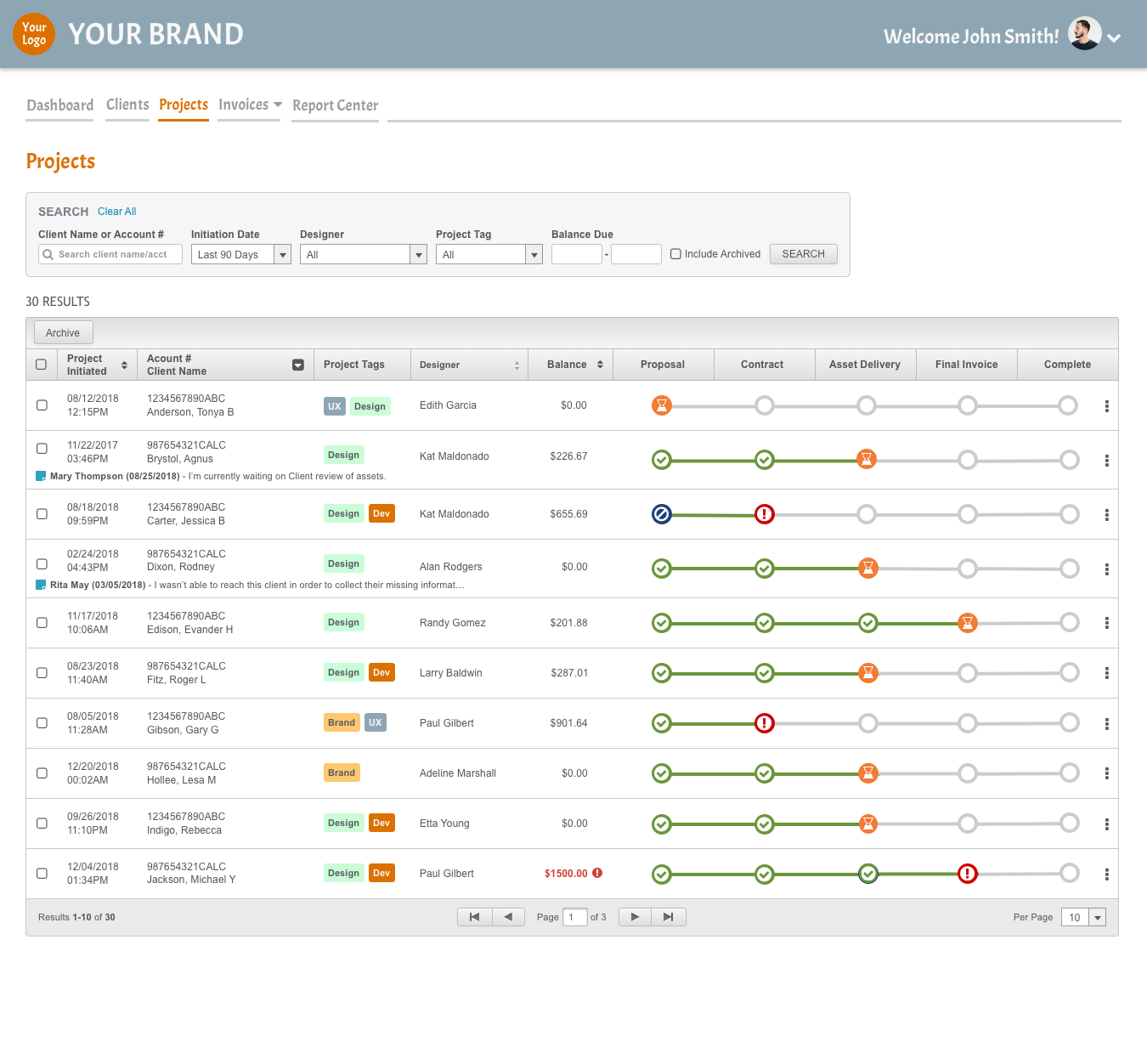
Design- Take II
I applied the lessons learned during my first round of testing to a new design. In the new one, there were no blank columns but some indication of status in all of them. I attempted to make it easy for users to immediately see the current status of their projects. I also added a “Complete” column so projects could be marked complete when they were finished.
Find Me Online