Airport iOS App & Dashboard
Challenge
This is a personal project I completed on a freelance basis. The client was working with a local airport that wanted an emergency iOS app that emergency responders and airport personnel could download to their phones and reference during an emergency situation. In addition to the app, the director of the airport would need an online dashboard they could reference with data on the app, where they could also control user access.
Role: App/Web Designer
Tools: Pen & Paper, Sketch, Axure
View WireframeDiscovery
I had an initial consultation with the client to discuss their needs, goals, and overall envision for the iOS app (the dashboard came later).
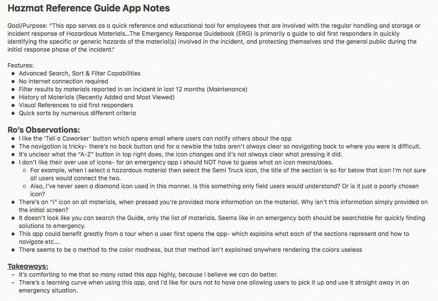
I took their feedback and started preliminary competitor analysis. Here is an example of the notes/takeaways from researching a Hazmat App that performs similarly to the app the client wanted.
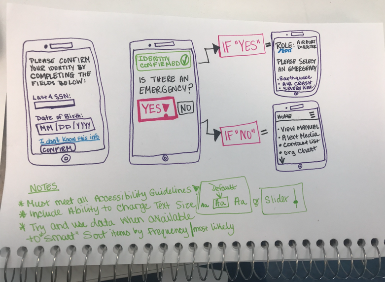
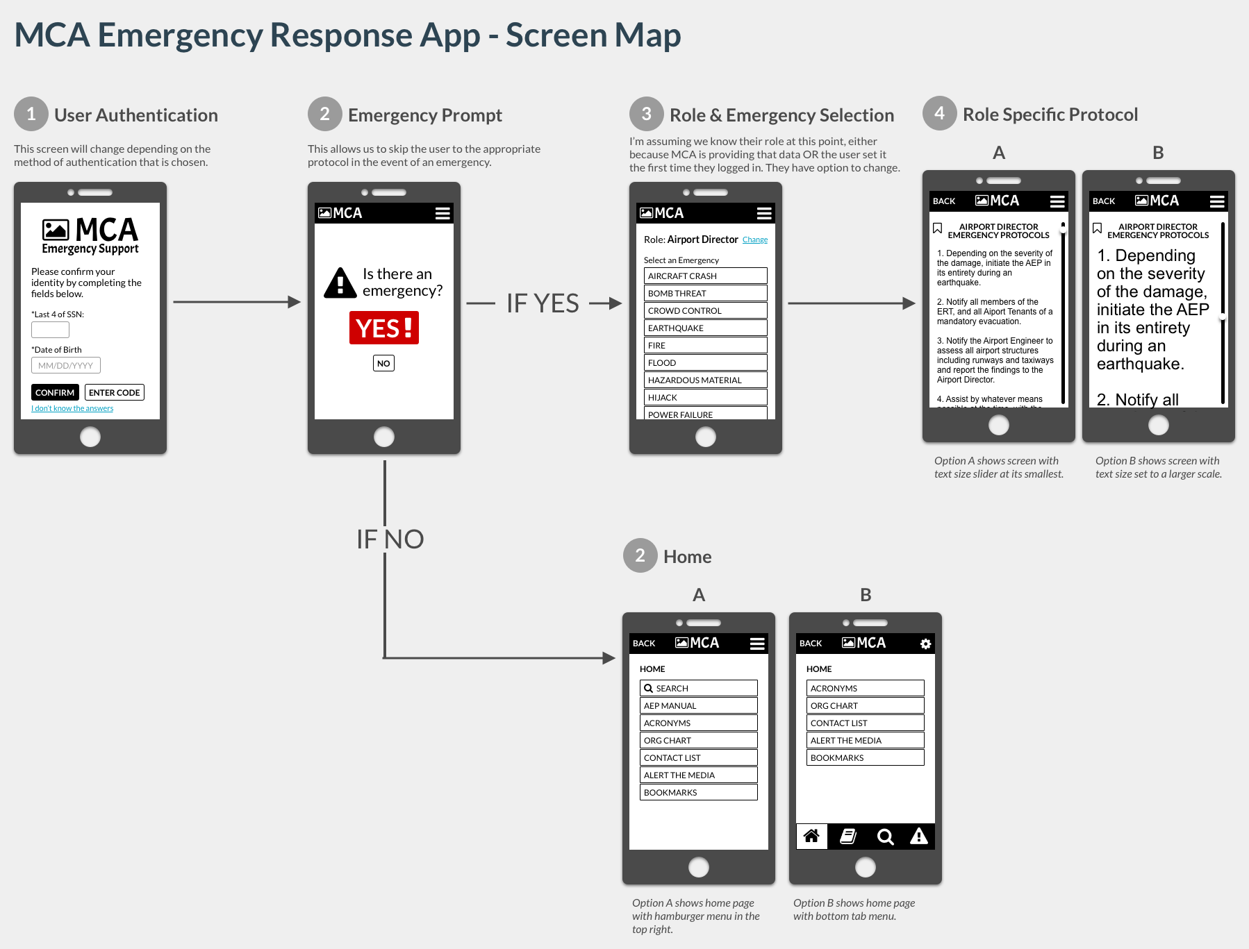
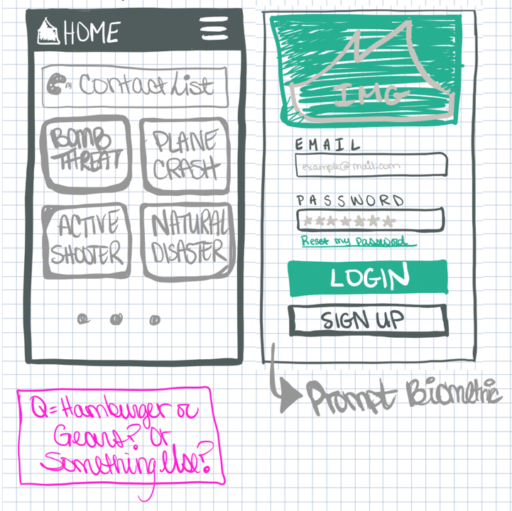
I then began design sketches, which developed into a screen map. As I worked through the logic and requirements, I had many more questions, so I sent the screen map and questions to the client for review.
My questions led to the client digging deeper with the Airport Director they were working with, which brought to light the need for a Dashboard where the director could maintain user access and see KPIs regarding use of the app.
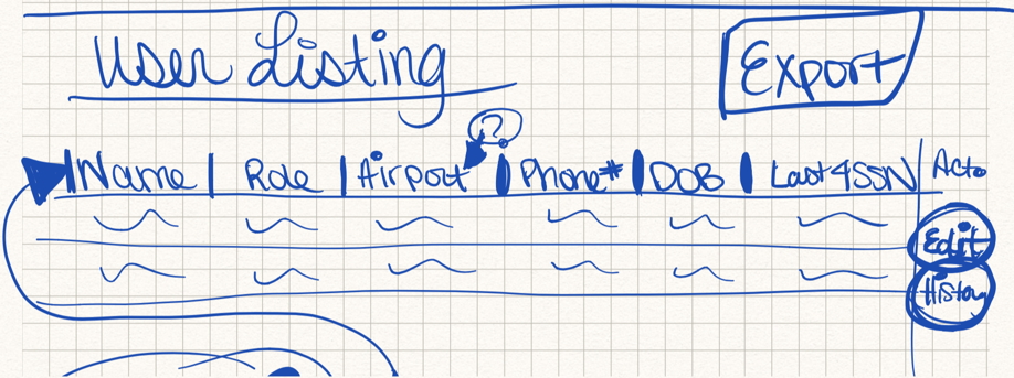
Now I had an iOS app and a dashboard to design. I took to sketching my ideas and writing down more questions as they came to me.
At this point I started storyboarding the design, creating a persona for the different types of users, and walking through the different paths a user would take. Always keeping in mind that the app had to be accessible, simple, and easy to use. The client didn’t want excessive use of color or branding either because they hoped to sell the app to other airports.
After some trial and error, I came up with an app that accomplished all of those objectives. The design is simple and straight forward and allows users in an emergency situation to quickly find vital information they need to carry out their duties.
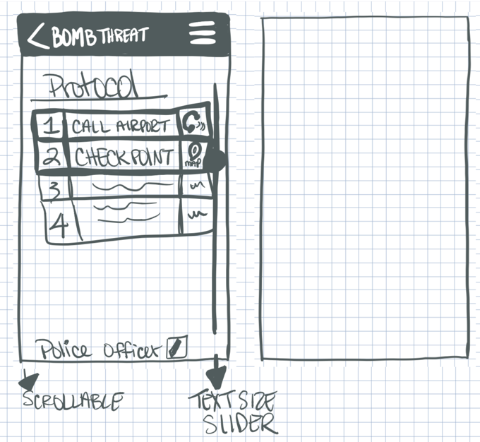
For example, I’ve provided the option to set the size of the text to small, medium, or large depending on the user’s current need. If for example a fireman left the station without his glasses, he should still be able to read the app for instructions.
Dashboard
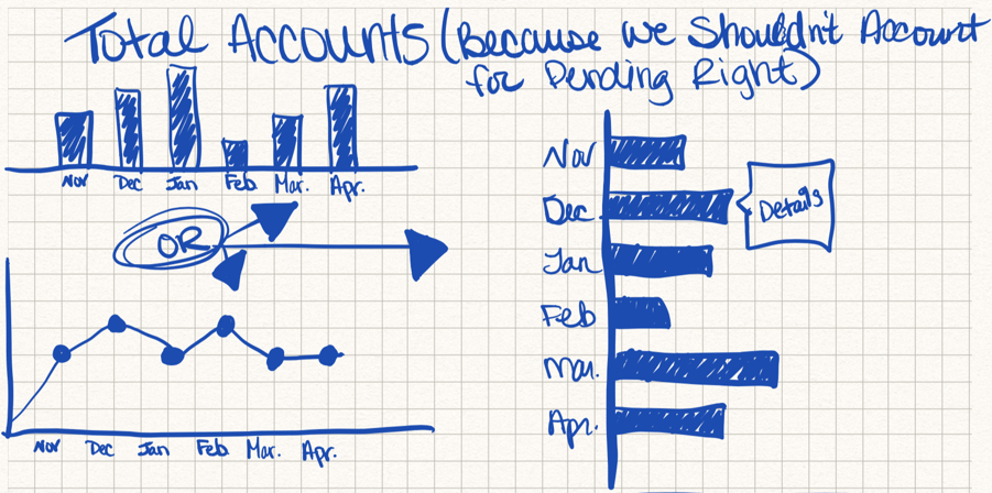
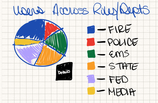
As for the dashboard, the client only gave me loose instructions so I made some assumptions about what data the Airport Director would want to see, and how they would want to maintain their users.
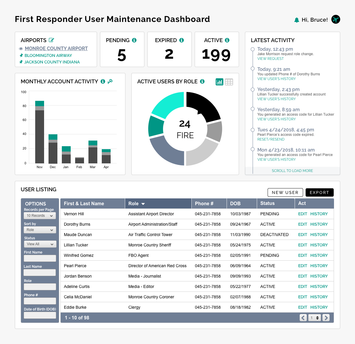
View Wireframe
UPDATE: This project was put on hold by the client while they do a little more R&D on market fit. My next step in the process would have been user testing, if the client takes up the project again in the future I will update my website with the final results.


Find Me Online