Client Listing SaaS App
DISCLAIMER: Some of the work I've done for past employers is private and I’m unable to share it directly in a public forum. For this project I have created an example without branding and changed the scenario from healthcare to a Marketing/Design Agency Project & Billing Software. Bare in mind that these projects may be missing sketches/discovery examples that I cannot include due to their private nature.
Challenge
Our users wanted to be able to see clients that fit certain criteria, such as an overdue balance or ones without a designer assigned to them. In the current listing there weren’t any indication of these statuses.
In addition, our larger agencies wanted their managers to have the ability to easily see all clients under a particular designer. This would make it easier for managers to assign new clients to designers with the bandwidth to take them on.
Role: UX Designer
Tools: Pen & Paper, Sketch, Axure
Discovery
In this instance, the PM had already performed quite a bit of discovery before deciding to include these features in their product roadmap. In their discussions with users they found that indeed a majority of them were concerned about the following statuses of their clients:
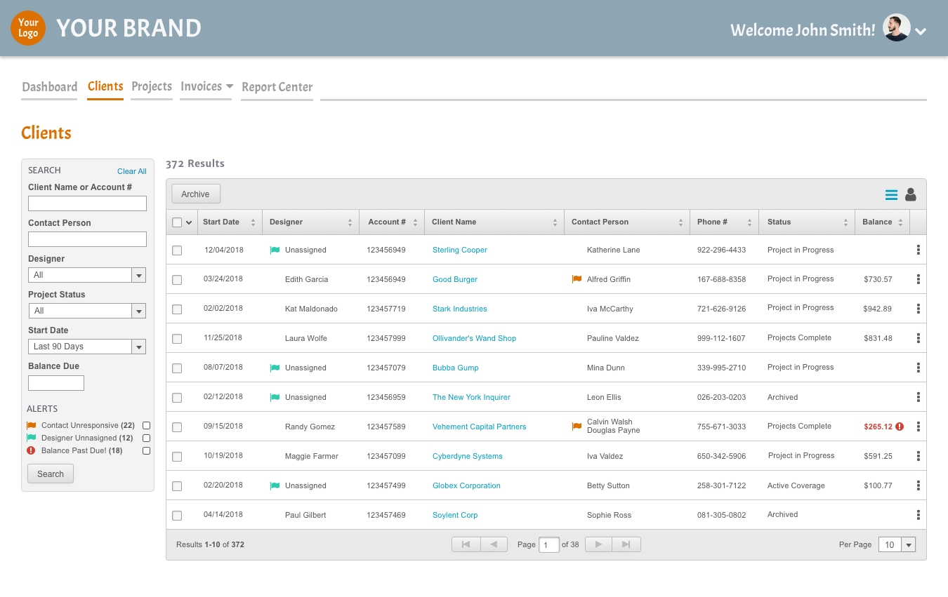
1. Clients with an Overdue Balance: Users wanted to know immediately if a client had an unpaid balance due before starting a new project with them.
2. Designer Unassigned: It’s already easy for managers to filter the Client listing by clients that have a designer set to ‘Unassigned’. However, many of our users have found that busy managers aren’t performing a check often enough. This flag alerts others working the client listing that the client needs a designer assigned so they can contact managers to have them do so.
3. Contact Unresponsive: For our larger agencies, it can be a problem on longer projects getting into contact with the client. This flag allows users to set a client as unresponsive and allow the correct person/department the ability to attempt to make contact successfully.
Design
My personal goal for this project was to add value to the page, without over styling or cluttering the current view. Our users do their work in our app and I wanted to keep their environment functional, yet clean. Which is difficult when adding three brand new icons to a listing page. It can start to look and feel cluttered pretty quickly.
So I tried a lot of different things. I landed on this option. The flags are noticeable, but not overpowering.
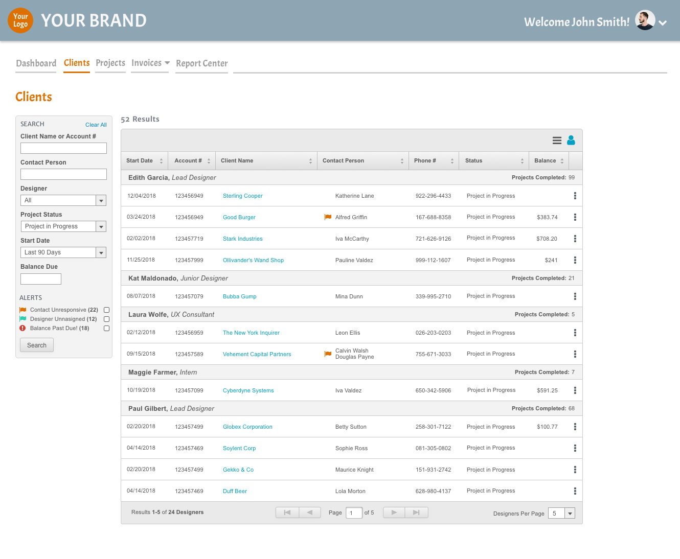
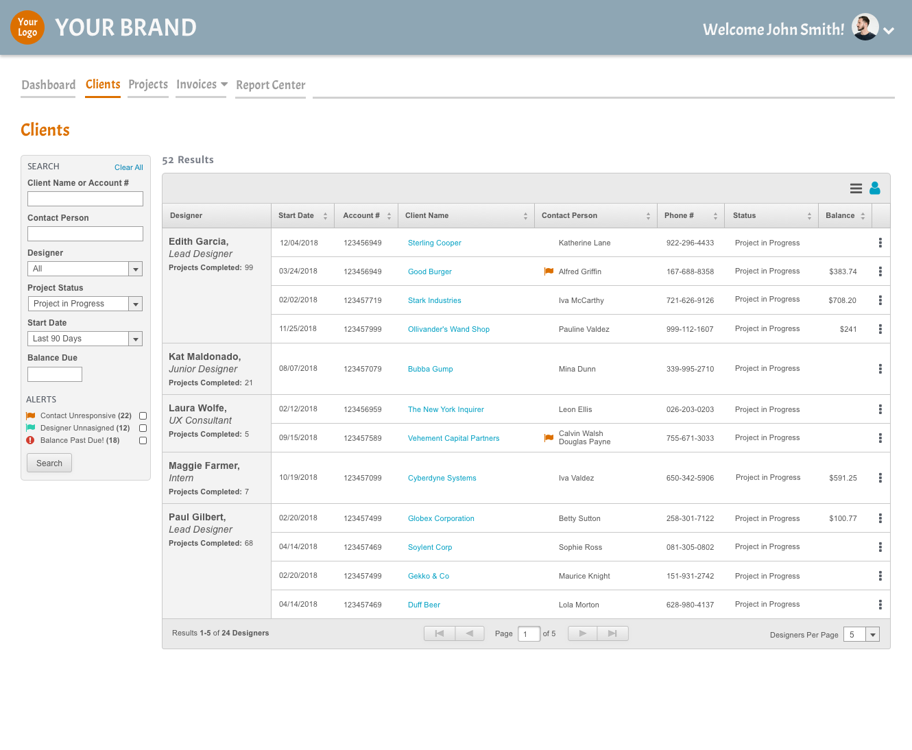
You’ll notice there’s also two icons in the top right - when the User Icon is selected I designed two options for how the listing could be grouped by designer. Both options provide a nearly exact experience- they simply look different.
Testing
We showed the designs to different users, and nearly all of them responded positively to the new flags. Afterwards I attempted to take their feedback and improve the design, but this is one case where I spent so much attention on the first draft and had such great discovery from the PM that there wasn’t much I could improve and no further design/testing was necessary.
As for the ‘Group by Designer’ feature- we almost had an even split of users that liked one view or another and no one we talked to hated one of the views. They were just excited that the option to group by designer would be available.
So, since our users loved both, we showed the designs to our developers. They felt strongly that one design was easier/quicker to build than the other and so that’s how we decided which one to go with.
Takeaways
- Sometimes you get lucky and your first draft is the right choice.
- It’s a good idea to include developers in you decision making, especially in a case like this one where either design is fully viable.
So I tried a lot of different things. I landed on this option. The flags are noticeable, but not overpowering.
As for the ‘Group by Designer’ feature- we almost had an even split of users that liked one view or another and no one we talked to hated one of the views. They were just excited that the option to group by designer would be available.
So, since our users loved both, we showed the designs to our developers. They felt strongly that one design was easier/quicker to build than the other and so that’s how we decided which one to go with.
- It’s a good idea to include developers in you decision making, especially in a case like this one where either design is fully viable.
Find Me Online