Alumni Association Membership Portal
Challenge
This is a personal project I completed on a freelance basis. The client was asked to build an online database that housed yearbook photos and alumni contact information. Their goal was to have a free version where all alumni could login and view photos of their fellow classmates, and a paid membership where in addition to the yearbook photos they could see current ones and classmates contact information.
There would also be an association newsletter archive, a memories page where paid members could submit photos, a calendar of events, and group page where alumni could join groups with others of similar interest, such as Band Members, Athletes, etc.
Role: Designer + Front-End Developer
Tools: Pen & Paper, Sketch, Invision
View WireframeDiscovery
After our initial consultation where the client and I discussed the app’s requirements and what he and his client hoped to accomplish with the project, I began sketching ideas.
Persona
The persona was particularly important for this project, because all of the users met very specific criteria. They would all be of the baby boomer era, which meant a majority of them would have limited experience with modern web technologies/interactions and some might have trouble seeing funky fonts or small text.
Here is a persona I hand wrote and continually returned to review during the design process. Since I’m the only designer I didn’t think it was a valuable use of my time to design a fancy persona in sketch, but the exercise of writing it was extremely helpful.
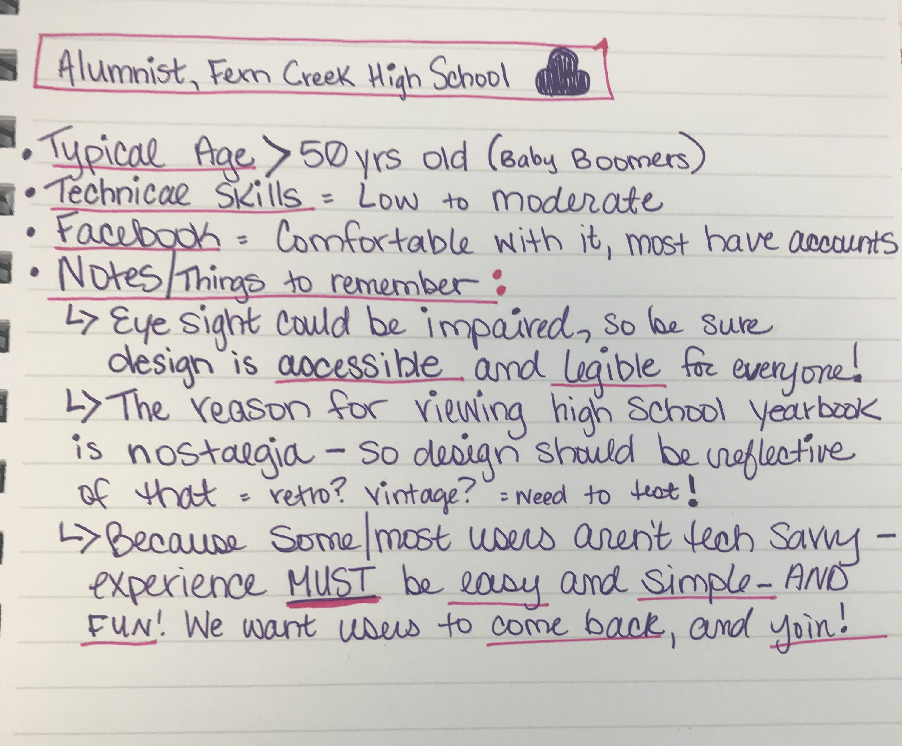
I think some designers my age might have taken an app designed specifically for baby boomers and attempted to create something bland with huge fonts and no flair. I didn’t want to do that. I had an amazing relationship with my grandparents, and my grandpa was actually pretty computer savvy, as would be some of the users- so I wanted to design something easy to use- but fun. The more fun the users had, the more likely there were to buy a membership as well!
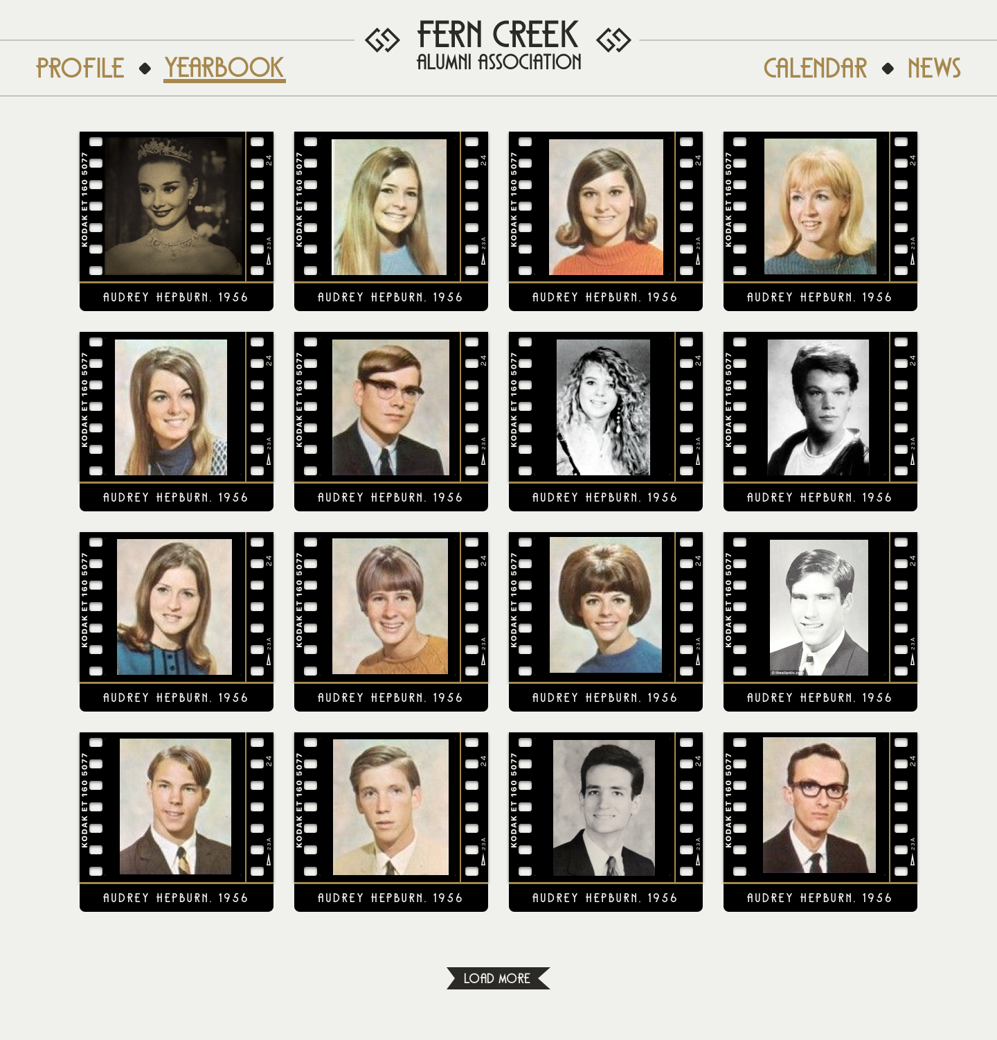
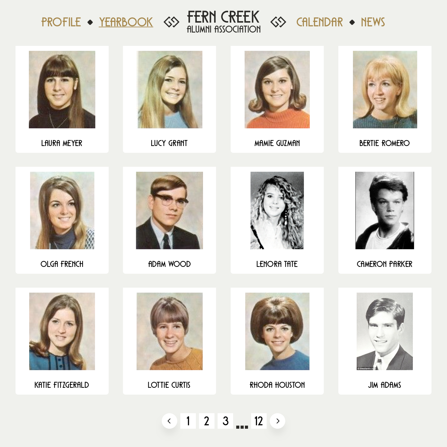
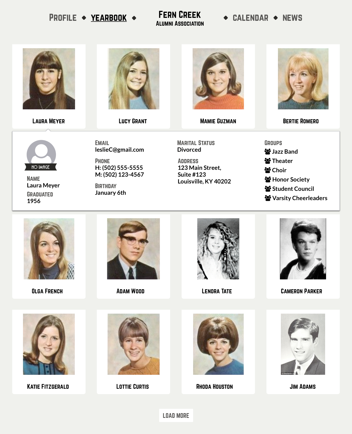
So I started designing just the yearbook listing, this way I could give the client options and then design the rest of the app based on which design he preferred. The movie reel was my favorite. I think it complemented the era of photos it would house, and would remind users of the days in which the photos were taken. In the end, the client preferred the simpler version with navigation that was less styled and photos with a clean white background.
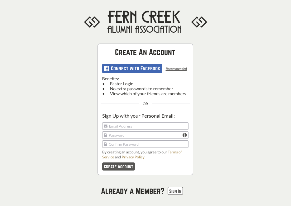
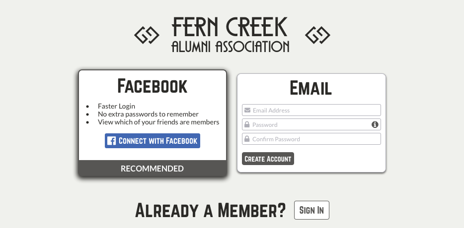
When I felt I had two valid options for accomplishing the same task, I would go ahead and design both, planning to complete A/B testing at a later date. Below is an example of two login design options:
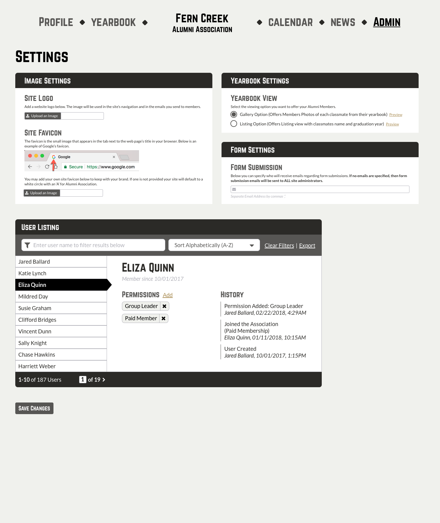
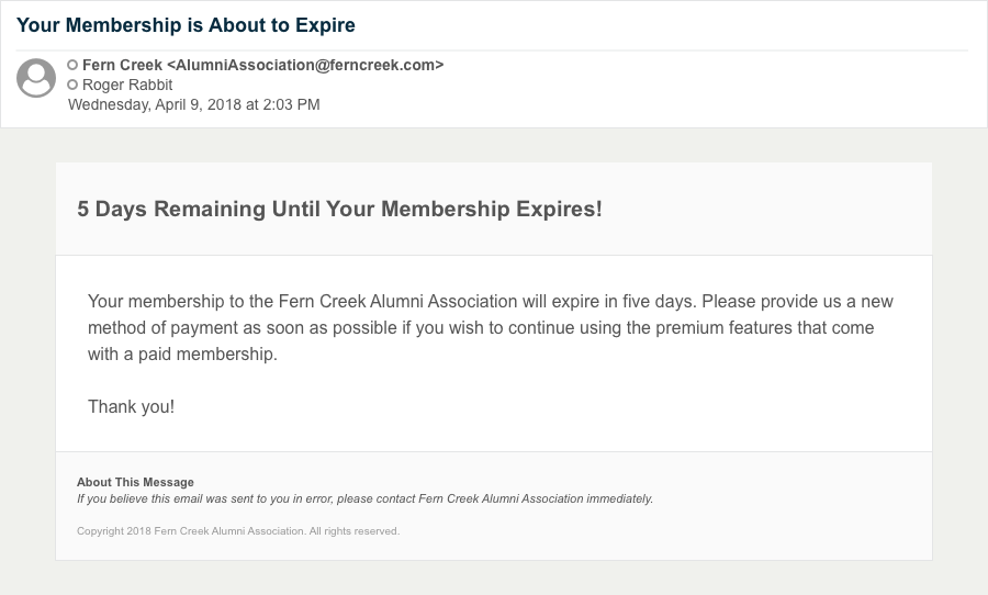
Then once I had designed every major screen, I dug deeper. The challenge in designing a new application from scratch is making sure you account for all scenarios, such as errors and administrative tasks. Below are some examples of the those designs. There’s a separate navigation for Administrative users where they can manage membership access and settings for the application. I also designed an example of an email users might receive regarding their account.
Here is the final wireframe.
View WireframeNOTE: I completed this project in late 2019, if you'd like to see the live app please contact me and I can get you a username and password to the staging site, or access to the github repository. Thank you!
Find Me Online