Back to Work Samples
theClick iOS App
Challenge
The requirements in a nutshell were for a simple iOS app which would deliver 2-3 posts per week with fashion or beauty content aimed at women aged 18-39. The posts would be hand selected by a group of women the client employed, with the goal being to deliver curated tips and product recommendations to users just like a great best friend would, if only they had the time.
Role: UI/UX Designer
Tools: Pen & Paper, Sketch, TypeForm, Social Media
Research
I began with a competitor analysis, where I took a look at the design and layout of similar apps such as Jump Rope, This AM, The Skimm, as well as news apps like Smart News. I then took a deep dive into trends within the app's demographic. I took this step in the process seriously, because a fashion and beauty app needs to have it's own voice and brand, yet also draw from trending styles to feel relevant.
Design
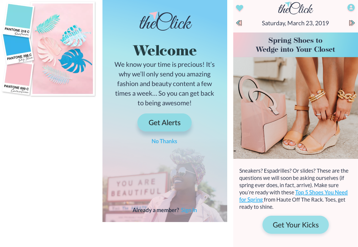
I decided to design this app in reverse order from how I typically do so- by starting with testing out different colors, fonts, and styles before I ever wired up an interaction. The workflow of this app was very simple and straightforward, it was the style that I knew I had to really spend some time on. I tried numerous variations and shared them with the client, and we all had a clear favorite. We thought this was going to be loved by all, but we decided to still test it to make sure.
Testing, Round 1
We worked with the client to design a usability test that provided us feedback on the success of the design, as well the overall reaction to the app itself. Here are the things we wanted to test:
- Visual Appeal (UI)
- Ease of Use (UX)
- Would the user download the app?
- Did the user feel that the app provided them value?
- Demographic Section: AGE, GENDER, ETHNICITY
# of Participants
20 (All Female)
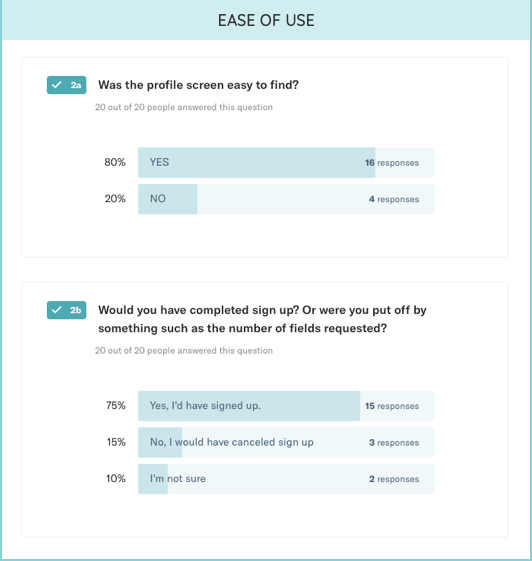
Boy did I learn a lot with this round of testing. For starters, pink is a very controversial color. Women seem to love it or hate it. When asked if they found the design visually pleasing, it was split 50/50.
POSITIVE:
"The color scheme is beautiful and inviting."
NEGATIVE:
"There are too many fonts and colors. Not a fan of the super girly twisty font, I feel like that's very 80s."
POSITIVE:
"Super user friendly with easy to find icons. I definitely would have signed up because the articles looked interesting and it only takes one step to sign up!"
NEGATIVE:
"Too many irrelevant info fields needed"
Outcome
The experience tested highly, and not to brag, but 2 of 4 that answered 'No' in the ease of use section gave away in the comments that they're issue was with the prototype and not the app itself- meaning we really had a 90% success rate with the UX- not bad. The UI on the other hand had too many nagative reviews for myself, or the client, to be happy. Back to the drawing board we go! This is why we test people!
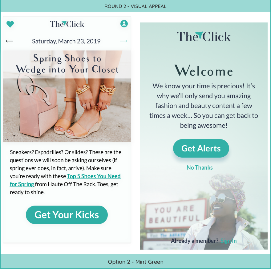
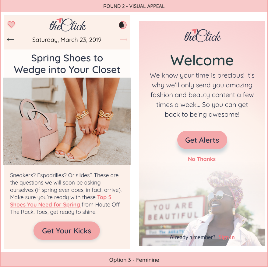
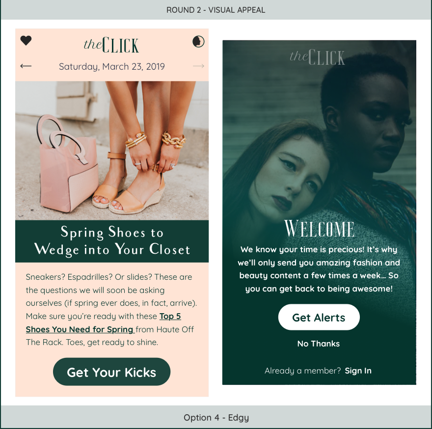
Design, Take II
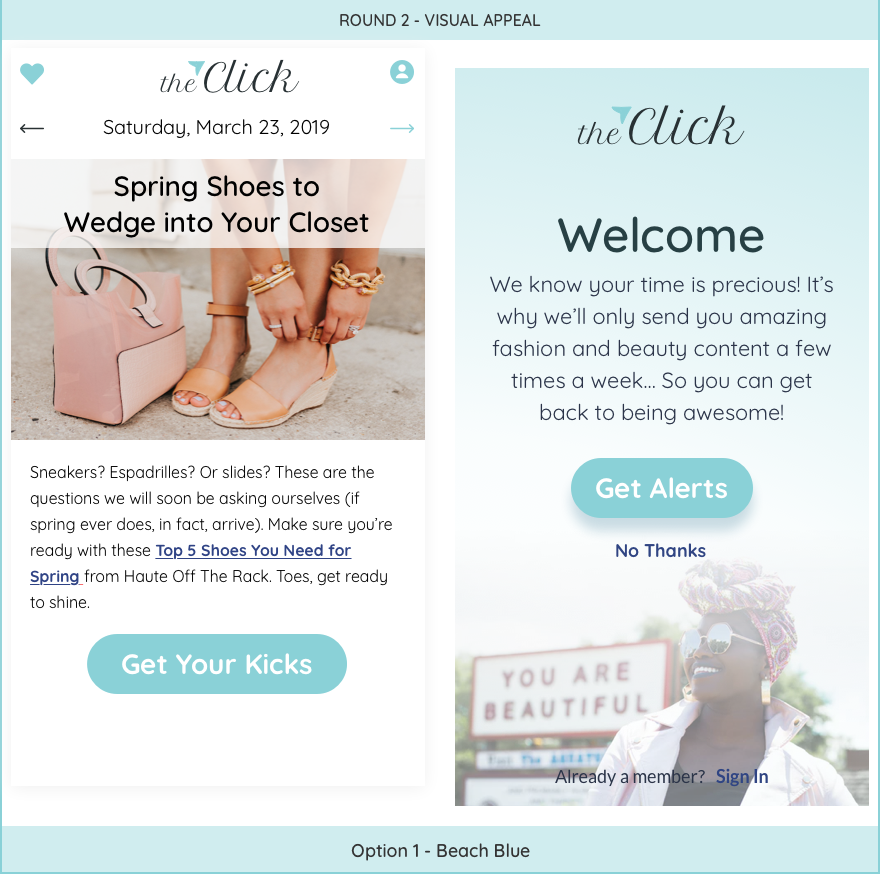
In my second attempt I wanted to still take some chances with some of the options, but also offer a few docile ones and just see which of them faired better in the testing. The following four options are the ones we decided to test again:
Testing, Round II
# of Participants
35 (All Female)
I used Typeform to create a survey using their 'Logic Jump' feature. In the survey I started with options 1 and 2- depending on which option they selected as their favorite they were then shown that design against option 3, then again with option 4, until they had selected the option that they felt was the most visually pleasing overall. They were then offered an open ended comment box where they could tell us why they chose that option, and what they didn’t like about the others.
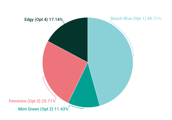
There’s always a chance that you’ll take the time to perform a test like this, and the results will be so close that there isn’t a clear winner. Thankfully that was NOT the case for us. Of the 35 participants, 16 (roughly 46%) selected option 1, which was the blue one. We also were lucky in that not a single one of the participants had anything negative to say about this option either.
Takeaways
Although I learned a great deal from this experience, I think the obvious takeaway is the importance of testing your designs. Both the client, myself, and my team were very happy with our initial designs, but our target demographic had mixed-reviews, none of which we would have known had we not asked.
Find Me Online